
According to experts in the field, ‘hamburgefontsiv’ manages to bring together most of the formal characteristics of a font quite well, which is a relief for those who want to quickly see how their font behaves in a text without having to create all the letters of the alphabet. There is the chain that I learned about from my experience with ‘Los Latino’ (the name we affectionately give to the LatinoType team). The first time they asked me, without further explanation, to send them a ‘videospan,’ it was a little strange and funny; I had no idea what they were referring to.
Very recently, I also learned about the existence of the ‘changosy’ chain used in the Typography and Lettering Diploma course at ‘La Chile’ (University of Chile), among many others that must be out there. Our friend Alfonso García suggested us to consider the ‘nova’ model, which, just by looking at it, shows us its notable virtues in terms of typographical representativeness.
I remember that in 2006, at the School of Graphic Design at the University of Bío-Bío (Chillán, Chile), our ‘Typography’ study group once had this type of discussion. At that time, we used to use the ‘xhop’ chain with the idea of defining the main characteristics of our typographic ideas. ‘p’ helps to find ‘descenders’ while giving us a clear clue as to what the vertical strokes would look like, the proportion of the straight letters through the ‘h’, the shape the ‘o’ preview us the proportion of the round letters, ‘x’ give us a rough starting idea of the style of the diagonals through it, among other characteristics.
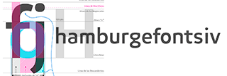
Typographical representativeness of «fj»
Personally, I usually design the pair ‘fj’ to quickly define as many formal characteristics and proportions of a font as possible (base line, x-height, ascender and descender, diacritic line and, by approximation, the height of uppercase letters, proportions of ‘n’ and, through this, the relative proportion of ‘o’ and the interior counterforms of these, the spacing between letters), all in a very small physical space, such as the loose sheets of paper I usually sketch on, my small notebooks or travel diaries, which are usually full of drawings of letters and notes of various kinds.
Lately, as I focused my ideas on a much broader design project, I had to be clear about the proportions that would be necessary for the extreme weights, considering a wide range of both weights and widths, from the heaviest and narrowest variant, ‘UltraCompressed ExtraBlack,’ to the heaviest and widest variant, ‘UltraExpanded ExtraBlack.’ so I found it necessary to determine in advance the spaces that would need to be reserved for those glyphs (letters, numbers, or other typographic symbols) that occupy the average height of the x, such as ‘a, e, g, k, s, x’. My conclusion was that the letter ‘s’ allows for an efficient distribution of both vertical and horizontal spaces necessary to design most lowercase letters, as does the letter ‘S’ for most uppercase letters that occupy the average height.
It is important to consider them when it comes to ‘avoiding endless days of corrections and future conflicts’ over distribution or space availability, especially in the development of projects as extensive as these large type families, which not only have wide ranges of weight but also multiple width variables, not to mention their slant variants, and not to mention superfamilies, which are increasingly present in the typographic universe of today.
Now my processes will not only focus on my beloved ‘fj’ but also on ‘s’. Now it will be ‘fjs’ that will very possibly evolve into a much more efficient and pleasant abstraction for solving font design.